SEO Guides, Tips & More!
Learn from Our Experience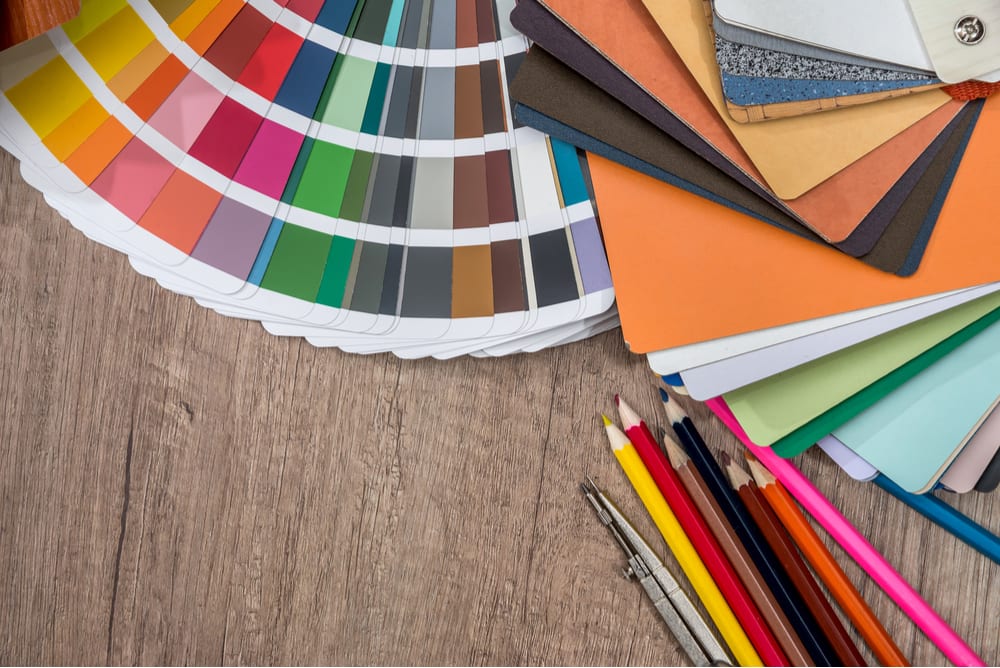
Lessons in Color
On any given day, the eye sees thousands of colors in all the various landscapes and scenes we are bombarded with. Visuals that come to mind are red roses, cotton candy pink sunsets, turquoise blue seas, and misty purple mountains. Our world is saturated with unequaled artistry through nature and its elements which makes everything we see a visual delight. While Mother Nature has her way of creating colorful and meaningful art that tugs at the emotions – designers do also. In our professional world, this can be demonstrated by an interior designer preparing a color palette for a new living room, a graphic designer examining a new color scheme for a firm’s website or a product designer selecting the most memorable color for a new product launch. No matter the profession, the point is that a good deal of thought and psychology goes into color selections. To help our clients better understand this topic, FlashPoint Marketing has prepared a summary on the emotion and meaning of color, industry significance insight and current color trends.
Emotion and Meaning of Colors
Everyone typically has a favorite color. Perhaps it’s a tranquil blue, electric yellow or a shade of gray. Do you ever stop to consider why or how seeing that color makes you feel? Usually the answer is quite subtle which makes sense because colors are intimately connected to human emotions. Oddly enough some of these emotions can be described in common phrases such as:
- “Getting the red-carpet treatment”
- “Brown bagging lunch”
- “Moving on to greener pastures”
- “Being tickled pink”
The below chart outlines emotion and characteristics that are linked to colors:
How Colors Correspond to Accounting
While colors are connected to emotions, they are also closely related to business and industry. Colors have meanings and when used right can have a positive impact both internally and externally. Some examples include the following:
- As discussed above, colors tie into emotions. A phrase such as “in the red” has a negative meaning financially. Therefore, red is not a color often seen in the branding and marketing of the banking industry.
- Have you ever wondered why children’s toys and their packaging materials are usually bright, primary colors such as red, blue and yellow? This is a deliberate choice because children naturally gravitate toward such bold colors which explains the phenomena in a toy aisle.
- Hospitals can be places of high anxiety and stress for many which is why a simple way to encourage calmness to a patient is through soothing interior colors as well as doctor and nurse scrub uniforms. Cool colors such as blues and greens tend to be more calming, therefore elements such as walls or linens in these shades can help put people at ease because they offer a sense of tranquility.
- For years, airlines have typically used shades of blues for the fabric of their cabin seating because it offers passengers a sense of trust, security, and calmness. However, in recent years, subtle tinted grays have emerged as a cabin textile trend. As airline technology advances, so does the intent to come across as innovative, high tech, and modern while maintaining the feeling of calm.
Color Trends
One of the most popular color trendsetters for the design industry is Pantone. Pantone is a company that was founded over 50 years ago with the intention to create an innovative system for identifying, matching and communicating colors to solve color accuracy issues within the graphic arts industry. Since then, Pantone has expanded to other color-dominant industries including fashion, interior design, architecture, product design and more.
They have successfully created the “Pantone Color Institute®” which was formed to study how color influences human thoughts, emotions, and physical reactions. The institute prides itself on choosing and releasing a “Color of the Year” annually which is beloved in the fashion industry as well as other creative circles. Chosen colors of the year always have emotive and memorable names such as past colors “Rose Quartz (2016)” and “Radiant Orchid (2014)”. The 2019 color of the year is “Living Coral” and you can learn more about it here.
Closing
While the world of color and color psychology is a much broader topic than can be explained in a short article, it’s apparent that choosing the right color can attract the audience you seek and subliminally affect their mood and behavior. The takeaway – color is more influential than most realize and a happy, relaxed customer equals a happy client.