SEO Guides, Tips & More!
Learn from Our Experience
Landing Page Best Practices 2019
When it comes to creating an effective, high-converting and successful PPC campaign, lots of effort and energy always goes into the creation of ads. We draft them, refine them, target them, launch them, rewrite them, relaunch them and retarget them, all in the name of creating something that will lead to the highest possible conversion rate.
But the ad itself is only half of the battle. In fact, some consider it the slightly less important of the two sides of the PPC coin. That’s because,without a powerful, well-constructed and high-converting landing page, all the advertising budget you spend on PPC advertising will amount to not much at all.
Why? This is because the ad is the mechanism that gets someone interested enough to click on the link. Once that happens, the success or failure of the conversion is completely dependent on the layout, formatting and even load time of the landing page.
What is a Landing Page?
Most believe that a landing page is just another page on their website and, outside of minor content changes, is not much different. However, this is simply not the case.
Okay, so then what is a landing page? Below is a great explanation (kudos to the Landing Page Course)

Landing Pages that Convert
So how do you create a landing page that’s high converting, helps you rank well with Google and does the hard work for you so that you can sit back and bring in new leads and customers? We’ve put together this guide of some of the most important keys to making your landing page effective — as well as some of the big no-no’s that you want to avoid when creating your page.
These tips will help you convert at higher rates, attract more traffic, and climb search engine rankings like a rocket to the sky — all while providing real and genuine value to your site visitors.
What to Do
Let’s start with the positive — these are the 12 most important factors in creating an effective landing page. It begins with how you communicate with your audience before shifting to the design of the page and then to extra tips to boost your landing page game to the next level. Let’s dive in.
Give Exactly What You Promise
This tip is at the absolute top of our list for a reason. It is hands-down the number one, most important thing to ensure when creating your landing page. No matter what else your goals may be, it’s vital that your landing page delivers on the promise set up by your ad.
But what does that mean, exactly?
It means that when individual browsing away on Google, sees your ad or link description and decides to click, they should receive exactly what they expect to receive when they land on your page. No surprises, no tricks and no diverting attention to something other than what you promised.

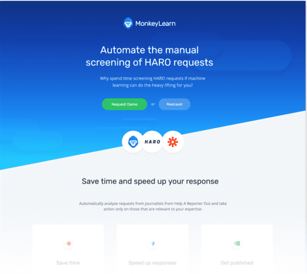
This landing page offers a specific, clearly explained value that connects specifically to its link description.
Why is this so important? Two reasons — first, anyone who’s ever been on the internet knows that arriving at a website only to find you’ve been misled about what it contains is infuriating. There’s no quicker and more effective way to turn off your visitors after you’ve worked so hard to get them to click on your link. They’ll ‘X’ out of your site faster than you can say ‘marketing budget.’
Second — Google is always watching. When multiple visitors are leaving your site almost immediately after arriving, their algorithms take notice. They interpret that behavior to mean that your site isn’t providing real value, or worse, it’s misleading or lying to visitors. That will send your site to the absolute bottom of the barrel when it comes to search engine rankings.
So please — make sure your landing page lines up with what’s written in your ad and link descriptions.
Build Trust First
Too many landing pages immediately launch into a sales pitch about why their product or service is the greatest thing in the history of humanity. But if someone has just stumbled across your ad and decided to give it a click, you are literally an absolute stranger to them. You might be selling an online business course guaranteeing massive revenue increases, but as far as they’re concerned, you could be a 14-year-old high schooler who’s never sold anything in their life.
So, your first goal when speaking to a new visitor to your page (after you’ve asked an intriguing question or made a bold statement) should be to build up some trust and goodwill. Introduce yourself or your company. Tastefully mention some of your successes, which we’ll touch on a bit in a later section. Build authority for yourself. Prove that you’re worth listening to when it comes to the industry you’re operating within, and you’ll see much higher conversion rates from your audience.
Nail Your Call to Action
Now that we’ve talked about the start of your page, let’s skip to the end. The call to action is one of the most important aspects of your page.
This is where all the work you’ve put into your page in building trust, identifying the problem, presenting your unique solution and establishing value finally come together.
If you want to know how to write a great call to action, focus on the phrase itself — call to action. You’re meant to inspire your site visitors to do something. And that begins long before your actual call to action ever appears.
Your entire landing page should be built to increase momentum from the beginning to the end.
Think like a storyteller. Your landing page should build interest and excitement, identifying problems and showing how your product is the solution until bang — it all climaxes with the call to action. Imagine you’re a hero calling his fellow soldiers into battle. You shouldn’t think of it as making a sale, you should think of it as inviting them to join your team — and if your page has done its job up to that point, they’ll want to be involved.
Simplicity is Your Friend
Too many landing pages try to do and say too much all at once. Michael Siebel, a leader of the startup accelerator Y-Combinator, once said regarding investor pitches — “The more you talk, the greater the chance you have of saying something they don’t like.”
This is equally true of landing pages. You should go for maximum value and impact, not word count. You want to have some content and information in your landing page, but your goal should be to pack as much information and impact into as few words as possible. Whether that means 300 words or 1,500 words will depend on your product, industry, audience and other factors—but efficiency should always be on your mind when writing your copy.

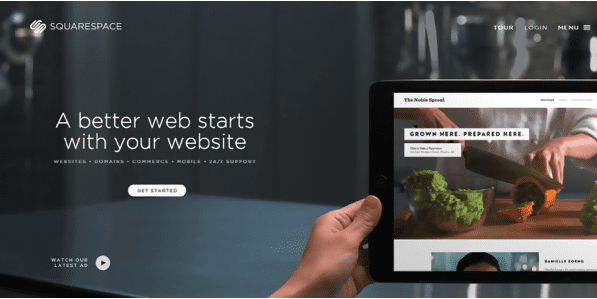
Notice the simple, straightforward design of this Squarespace page.
Shorten Load Times
Let’s shift gears for a moment. We’ve been talking about the content of your site, and we’ll touch on that some more in a moment, but it’s time to address one of the most important elements of your landing page that have nothing to do with how it looks or what’s written on it. It has to do with the invisible code that runs your site.
Your landing page must load quickly.
According to Neil Patel, a one-second delay in landing page load time can result in a 7% reduction in conversions.
The average attention span is mind-numbingly short, and until you’ve demonstrated value, users are just looking for any reason not to stay on your page. If they click an ad (an action which most people are already skeptical of doing) and the page is slow to load, they’re going to get annoyed, frustrated, or even suspicious.
Invest in a developer or team who knows how to maximize your site’s load time to shorten the time between a user clicking your link and the content appearing in front of them. The shorter, the better.
Know Your Goal
One mistake many landing page creators make is that they don’t think carefully enough about what exactly they want their landing page to accomplish. They know that they want people to come to their page and see their content, but they don’t have a specific goal in mind.
Having a distinctive, identifiable goal is crucial. It should be the focal point around which the entire landing page strategy is focused. Think of a basketball team. They run plays, practice sets, adjust, cut towards the basket, pass the ball around the perimeter, fake left and go right — but it’s all in service of a very simple, identifiable goal. Get the ball in the hoop.
Identifying your ‘hoop’ should be the very first step you take when designing your page. Do you want visitors to sign up for your mailing list? Agree to a free trial? Make a purchase? Request more information? Complete a survey? Download an eBook? Establish this goal before doing anything else.
The Power of (A/B) Testing
Invest in a developer or team who knows how to maximize your site’s load time to shorten the time between a user clicking your link and the content appearing in front of them. The shorter, the better.
Know Your Goal
One mistake many landing page creators make is that they don’t think carefully enough about what exactly they want their landing page to accomplish. They know that they want people to come to their page and see their content, but they don’t have a specific goal in mind.
Having a distinctive, identifiable goal is crucial. It should be the focal point around which the entire landing page strategy is focused. Think of a basketball team. They run plays, practice sets, adjust, cut towards the basket, pass the ball around the perimeter, fake left and go right — but it’s all in service of a very simple, identifiable goal. Get the ball in the hoop.
Identifying your ‘hoop’ should be the very first step you take when designing your page. Do you want visitors to sign up for your mailing list? Agree to a free trial? Make a purchase? Request more information? Complete a survey? Download an eBook? Establish this goal before doing anything else.
The Power of Testing
In another blog post, we discussed the incredible importance and value of testing multiple ad variations to identify the most effective approach. Many people don’t realize that they can (and should!) do the exact same thing with their landing pages. Create two options and test them both. Refine your approach. Make minor or major adjustments as required. You’ll boost your ability to deliver exactly the most effective approach to convert site visitors at an impressive rate that maximizes your ROI.
Say Thank You with a Unique Page
Never forget the value of good manners. When it comes to your landing page, it’s not just about making your mom happy. Creating a separate ‘thank you’ page gives you an opportunity to add more content directed specifically to leads that have already converted. That means you can alert them to new opportunities confident in the fact that they’ll be receptive to your messaging.
But more than anything, a sincere thank you and personal-feeling message will go a long way in making your converted site visitors feel connected and invested in you beyond whatever action they’ve already taken.
What Not to Do
Now that we’ve covered some of the most important things to do when it comes to organizing your page, it’s time to hit four of the most important landing page habits to avoid. We see these all the time, and they’re particularly dangerous because they can sometimes disguise themselves as effective ideas. We’ll explain why they should be avoided like the plague.
Build A Landing Page for Multiple Goals
When brands and organizations spend a substantial amount of marketing budget on their PPC plan and landing page, there’s a strong temptation that can tend to creep into their approach. With all that money being spent, they want to make the landing page serve multiple goals. That makes their landing page copy unfocused, unclear and ineffective at getting conversions. Stick to one major goal per landing page.
Distract Your Audience
Even when they’re focused on one goal, many landing pages try to say and do too much in service of that goal. They adopt a “see what sticks” approach, so unsure of what will work that they try several messaging strategies and approaches at once. They also make the mistake of adding links all over their page — why would you want to give your audience opportunities to leave the page?
This is where testing can save you — when you can try out different approaches, you don’t have to throw them all into one page. You can identify what works and move in that direction with confidence.
Skip the Design Phase
It’s not all about the words — spend time and attention on designing your landing page to be clean, clear and visually pleasing. It should also be clearly professional to show that you’re a trustworthy, established organization capable of meeting your site visitors’ needs.
Leave Things to Your Audience’s Imagination
Never assume your audience knows anything about your service, background, expertise or value. Be clear and complete in establishing your value. We’re all about efficiency and conciseness, but you should never sacrifice critical information in the name of cutting down your word count. You should constantly be asking yourself what questions your customers will have at every stage of your landing page, then finding ways to clearly and concisely answer them
Okay what do you think? What’s worked for your company or efforts?

